Visualization Gallery
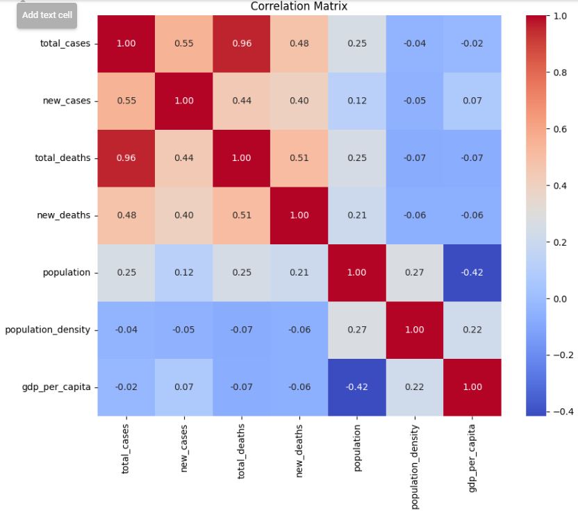
This is the heat map for the correlation matrix of essential health and demographic indicators. The red color represents high positive values (tending to 1) that indicate a strong direct relationship, and the blue color indicates high negative values (tending to -1) that express a strong inverse relationship. For instance, the total cases and total deaths are strongly positively correlated, as may be expected, for with more cases there is in general a tendency for there to be more deaths. Interestingly, the GDP per head does not correlate much with the total cases and deaths. Simply put, the wealth of a nation is not a predictor of the number of incidences or cases of deaths that occur. This matrix has an essential purpose in the strong identification of the factors most associated with the spread and impact of COVID-19.

The graph depicts The following histogram illustrates the spread of the total number of COVID-19 cases with respect to different geographical regions or entities. Skewness is highly skewed, steep drop-off, and long tail, characterized by most countries having relatively low numbers but a few countries showing extremely high numbers. These words mean that countries like these distort the total number of cases on a global level. Such visuals are helpful for the health policymakers to point out areas with a high number of cases per population so that they efficiently allocate their resources.
Similar to the histogram of cases, this histogram of total deaths from COVID-19 also displays a right-skewed distribution, suggesting most countries have a low death count, while a few are witnessing a horrifying death toll. This may help understand the impact of pandemic mortality among countries and may contribute to guiding the needed intervention of health urgency within the areas that are greatly affected.
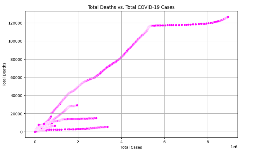
Countries with a high number of cases, indeed, have a higher number of deaths, but the rise in deaths is not proportional, giving a note that the deaths can rise at an alarming rate as the cases rise. Such a view can be of supreme importance to health authorities in the projection of the healthcare burden or mortality from the case's number.
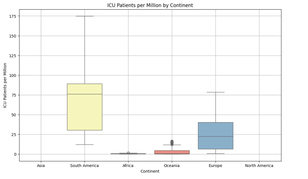
The manager's ability The box plot below shows the distribution of continent-patient groups in the ICU per million people, displaying the median and quartiles of each group. The length and distribution of the data give information on how the pandemic differs across local regions. On the other hand, a continent with a very high interquartile range and high median may be experiencing an increased number of critical cases that could warrant them in moving towards higher healthcare responses.
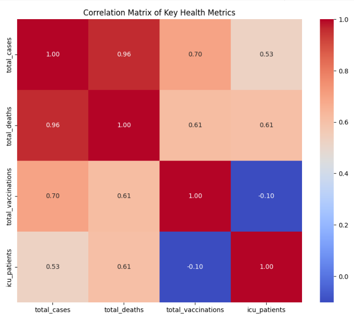
This second heatmap on correlation looks specifically at the health indicators, which include total vaccinations. The strong positive correlations between total cases, total deaths, and total vaccinations may show that countries with more cases and deaths also vaccinated more people, possibly in reflection of their outbreak severity. Notably, total vaccinations are in inverse relation to ICU's, and patients, meaning an increase in the level of vaccination, might be contributing to a lowering of severe cases needed to care for in ICUs
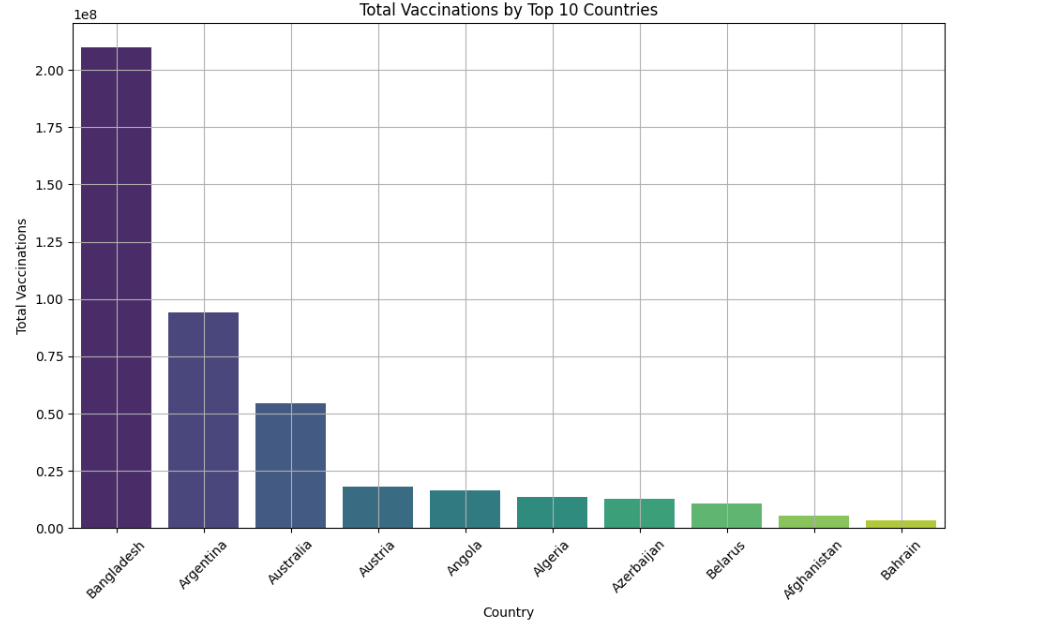
Interpretation from the following bar chart lists the top 10 countries based on their total number of vaccinations. This may throw the limelight on successful vaccination campaigns and may set an example for other countries. This might also be signaling an imbalance between countries in health infrastructure, population size, or available vaccines.
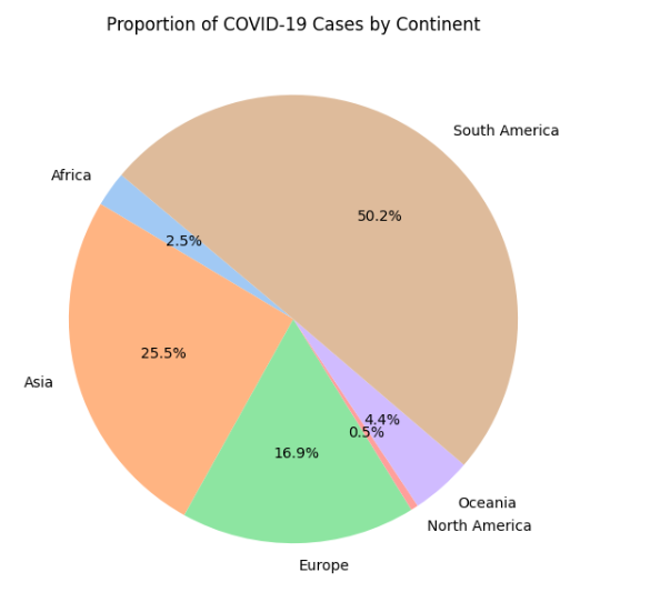
This pie chart gives a rapid visual view of the proportion of COVID-19 cases per continent. The size of each 'slice' allows immediate comparison of case distribution—i.e. which continents have most or fewest.This can be specifically very much useful when trying to understand global dispersion and identifying areas where there is a necessity for higher international support or resources.
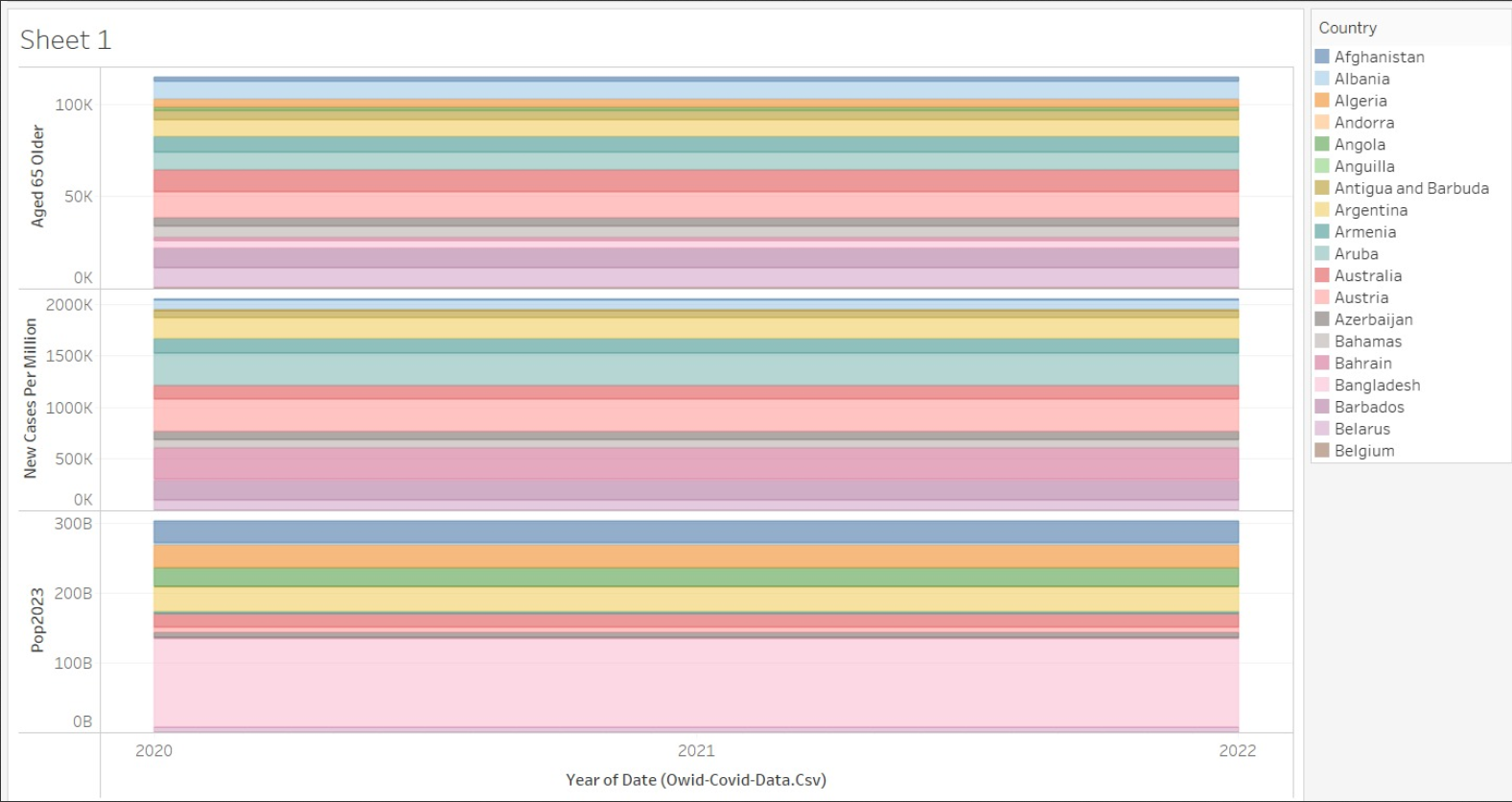
This stacked bar chart explains over time two variables: new cases per million and the country-wise count of the aged population. Each layer represents a different metric showing how they change from 2020 to 2022. The diagram very quickly looks at how the metrics change over time and will be able to point out some trends — say, for instance, an increase in cases or changes in the age demographics of a population. This would be really helpful in the dynamical assessment of pandemic-related changes and successful interventions at different times.
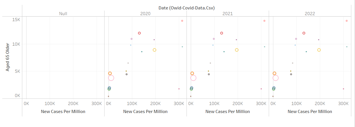
A scatter plot on this chart visualizes the number of new cases per million of the population against the size of the population aged 65 years and above for the different countries. Each dot in the chart may show a country where they may have been placed with respect to the number of new cases found on the y-axis and the size of the country's population aged 65 and over displayed on the x-axis. The x-axis, on the other hand, being the horizontal, evidently shows divisions in the label "New Cases Per Million" from 0 to 300000. On its part, the y-axis goes at length to inform that "Aged 65 Older" is a number that actually does not present looking very sharp, given that it can be read as 0 or 15000, probably where the numbers are given for thousands of people or another measure found in those particular statistics.
Each section contains a series of bars for every year, labeled "Aged 65 Older," "New Cases P...," and "Pop2023." These labels actually look truncated, but one would like to guess that "New Cases P..." would refer to new COVID-19 cases per million. "Pop2023" could mean that the year from which the projected bars would be is 2023. The axis with the scale for these—with markers on 0, 5K, 10K, 200K, 400K, 50B, and 100B—seems to indicate it might be the number of people or cases in the thousands, hundreds of thousands, or by billions.
This chart has bubbles on it that tell us two things: how close people live to each other in a place (that's population density) and how many of those people got sick with COVID-19. So, large bubbles mean lots of people get sick. We also could see that some places where there was many people live close in some places had a lot of people get sick but not all the time in all places.
It is a bar chart of countries placed head to head against each other, showing the number of their human populace. The bar is tall for countries that have a large populace. "It's like looking at a line of people where the tallest ones are the most crowded countries.".
This will represent bubbles for the countries; that is, their sizes will indicate how many people live in this country, and at the same time, they grow in time (meaning the increase in the population of that specific country). It's like seeing a family grow over the years, but it's on a national level.
This bar chart represents the saddest part about Covid-19 in terms of counting how many people have died from it based on different countries. The bar for the USA is the highest, so most of the deaths happened in the USA. So, we can conclude that with the help of this chart, at some places, deaths were many, and at some others, deaths were few.
Here, we are comparing only two countries, USA and India. It's a simple bar chart, which illustrates the fact that the USA had over twice as many people falling sick with Covid-19 as India did.
It is a bar chart representing the total number of people who contracted the virus of Covid-19 in different places of the world. The highest bar is for the USA. More people have gotten ill there than any other place. Each bar is a different place. You can see how many got sick in each one.
This bar chart displays a relative analysis of a certain measurement in numerous nations. The different heights of the bars show the relative size of this measurement, which may range from new cases to vaccination percentages. This type of chart is useful for promptly determining the countries with higher or lower values of the variable being measured, prompting further exploration into the factors causing these discrepancies.
This is a stacked area chart that has been customized to become a cumulative metric visualization over time for multiple countries. In a sense, these layers constituted the build-up of metrics for each country, showing a total change. It is much easier to interpret the overall effect of the pandemic with time versus differentiating the intervention from one country and another. Such a chart helps give a sense of how the burden of the pandemic is getting shared across the world and what countries are driving changes in the cumulative metric.
This line graph represents the cumulative total at different time-points of a certain metric for multiple countries. This can give an idea of the rate of increase and the trajectory of the pandemic within a country. This increases a sudden rise or indication of outbreaks or case surges, while a plateau points toward effective control measures. The visualization may help compare the dynamics of the pandemic in different countries and prove quite useful while making an assessment of how timely and efficient this or that measure of public health is.
In this graph is something like a picture of dots, representing two things about countries—the total number of citizens living there and how tightly the area is populated. Countries with large populations don't always have a high density of the population living together. It is like comparing congested cities to sparsely populated countryside areas.
The line in this graph moves up and down to us over time how the number of people was getting sick with Covid-19, went by day and month. The blue line is much higher than this place, so much more people were getting sick.
This is a hill of the growing shape of the graph. It is the general shape of how the number of Covid-19 cases has grown over some time. Sometimes, the hill is very high, and this means most people became sick very quickly. It helps us to see when things may have become much worse and when they may have gotten a little better.
Graph of dots' clouds. Every dot tells about one country, another - how many people got sick there and how many people died. This sounded as though the countries that had more sickness always tended to have more deaths than others.
This is the heat map for the correlation matrix of essential health and demographic indicators. The red color represents high positive values (tending to 1) that indicate a strong direct relationship, and the blue color indicates high negative values (tending to -1) that express a strong inverse relationship. For instance, the total cases and total deaths are strongly positively correlated, as may be expected, for with more cases there is in general a tendency for there to be more deaths. Interestingly, the GDP per head does not correlate much with the total cases and deaths. Simply put, the wealth of a nation is not a predictor of the number of incidences or cases of deaths that occur. This matrix has an essential purpose in the strong identification of the factors most associated with the spread and impact of COVID-19.
The graph depicts The following histogram illustrates the spread of the total number of COVID-19 cases with respect to different geographical regions or entities. Skewness is highly skewed, steep drop-off, and long tail, characterized by most countries having relatively low numbers but a few countries showing extremely high numbers. These words mean that countries like these distort the total number of cases on a global level. Such visuals are helpful for the health policymakers to point out areas with a high number of cases per population so that they efficiently allocate their resources.
Similar to the histogram of cases, this histogram of total deaths from COVID-19 also displays a right-skewed distribution, suggesting most countries have a low death count, while a few are witnessing a horrifying death toll. This may help understand the impact of pandemic mortality among countries and may contribute to guiding the needed intervention of health urgency within the areas that are greatly affected.
Countries with a high number of cases, indeed, have a higher number of deaths, but the rise in deaths is not proportional, giving a note that the deaths can rise at an alarming rate as the cases rise. Such a view can be of supreme importance to health authorities in the projection of the healthcare burden or mortality from the case's number.
The manager's ability The box plot below shows the distribution of continent-patient groups in the ICU per million people, displaying the median and quartiles of each group. The length and distribution of the data give information on how the pandemic differs across local regions. On the other hand, a continent with a very high interquartile range and high median may be experiencing an increased number of critical cases that could warrant them in moving towards higher healthcare responses.
This second heatmap on correlation looks specifically at the health indicators, which include total vaccinations. The strong positive correlations between total cases, total deaths, and total vaccinations may show that countries with more cases and deaths also vaccinated more people, possibly in reflection of their outbreak severity. Notably, total vaccinations are in inverse relation to ICU's, and patients, meaning an increase in the level of vaccination, might be contributing to a lowering of severe cases needed to care for in ICUs
Interpretation from the following bar chart lists the top 10 countries based on their total number of vaccinations. This may throw the limelight on successful vaccination campaigns and may set an example for other countries. This might also be signaling an imbalance between countries in health infrastructure, population size, or available vaccines.
This pie chart gives a rapid visual view of the proportion of COVID-19 cases per continent. The size of each 'slice' allows immediate comparison of case distribution—i.e. which continents have most or fewest.This can be specifically very much useful when trying to understand global dispersion and identifying areas where there is a necessity for higher international support or resources.
This stacked bar chart explains over time two variables: new cases per million and the country-wise count of the aged population. Each layer represents a different metric showing how they change from 2020 to 2022. The diagram very quickly looks at how the metrics change over time and will be able to point out some trends — say, for instance, an increase in cases or changes in the age demographics of a population. This would be really helpful in the dynamical assessment of pandemic-related changes and successful interventions at different times.
A scatter plot on this chart visualizes the number of new cases per million of the population against the size of the population aged 65 years and above for the different countries. Each dot in the chart may show a country where they may have been placed with respect to the number of new cases found on the y-axis and the size of the country's population aged 65 and over displayed on the x-axis. The x-axis, on the other hand, being the horizontal, evidently shows divisions in the label "New Cases Per Million" from 0 to 300000. On its part, the y-axis goes at length to inform that "Aged 65 Older" is a number that actually does not present looking very sharp, given that it can be read as 0 or 15000, probably where the numbers are given for thousands of people or another measure found in those particular statistics.
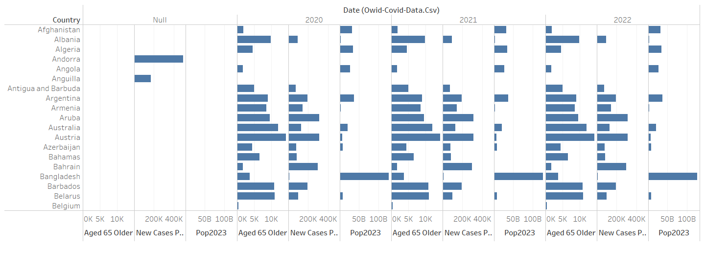
Each section contains a series of bars for every year, labeled "Aged 65 Older," "New Cases P...," and "Pop2023." These labels actually look truncated, but one would like to guess that "New Cases P..." would refer to new COVID-19 cases per million. "Pop2023" could mean that the year from which the projected bars would be is 2023. The axis with the scale for these—with markers on 0, 5K, 10K, 200K, 400K, 50B, and 100B—seems to indicate it might be the number of people or cases in the thousands, hundreds of thousands, or by billions.
This bar chart represents the saddest part about Covid-19 in terms of counting how many people have died from it based on different countries. The bar for the USA is the highest, so most of the deaths happened in the USA. So, we can conclude that with the help of this chart, at some places, deaths were many, and at some others, deaths were few.
Here, we are comparing only two countries, USA and India. It's a simple bar chart, which illustrates the fact that the USA had over twice as many people falling sick with Covid-19 as India did.
This chart has bubbles on it that tell us two things: how close people live to each other in a place (that's population density) and how many of those people got sick with COVID-19. So, large bubbles mean lots of people get sick. We also could see that some places where there was many people live close in some places had a lot of people get sick but not all the time in all places.
It is a bar chart of countries placed head to head against each other, showing the number of their human populace. The bar is tall for countries that have a large populace. "It's like looking at a line of people where the tallest ones are the most crowded countries.".
This will represent bubbles for the countries; that is, their sizes will indicate how many people live in this country, and at the same time, they grow in time (meaning the increase in the population of that specific country). It's like seeing a family grow over the years, but it's on a national level.
It is a bar chart representing the total number of people who contracted the virus of Covid-19 in different places of the world. The highest bar is for the USA. More people have gotten ill there than any other place. Each bar is a different place. You can see how many got sick in each one.
This bar chart displays a relative analysis of a certain measurement in numerous nations. The different heights of the bars show the relative size of this measurement, which may range from new cases to vaccination percentages. This type of chart is useful for promptly determining the countries with higher or lower values of the variable being measured, prompting further exploration into the factors causing these discrepancies.
This is a stacked area chart that has been customized to become a cumulative metric visualization over time for multiple countries. In a sense, these layers constituted the build-up of metrics for each country, showing a total change. It is much easier to interpret the overall effect of the pandemic with time versus differentiating the intervention from one country and another. Such a chart helps give a sense of how the burden of the pandemic is getting shared across the world and what countries are driving changes in the cumulative metric.
This line graph represents the cumulative total at different time-points of a certain metric for multiple countries. This can give an idea of the rate of increase and the trajectory of the pandemic within a country. This increases a sudden rise or indication of outbreaks or case surges, while a plateau points toward effective control measures. The visualization may help compare the dynamics of the pandemic in different countries and prove quite useful while making an assessment of how timely and efficient this or that measure of public health is.
In this graph is something like a picture of dots, representing two things about countries—the total number of citizens living there and how tightly the area is populated. Countries with large populations don't always have a high density of the population living together. It is like comparing congested cities to sparsely populated countryside areas.
The line in this graph moves up and down to us over time how the number of people was getting sick with Covid-19, went by day and month. The blue line is much higher than this place, so much more people were getting sick.
This is a hill of the growing shape of the graph. It is the general shape of how the number of Covid-19 cases has grown over some time. Sometimes, the hill is very high, and this means most people became sick very quickly. It helps us to see when things may have become much worse and when they may have gotten a little better.
Graph of dots' clouds. Every dot tells about one country, another - how many people got sick there and how many people died. This sounded as though the countries that had more sickness always tended to have more deaths than others.